Outline meaning in art is simple: an outline is a line that marks the outer edge of a shape or object. It shows your eye where one thing ends and the next begins.
There is more to the story, though. Artists have used outlines for thousands of years, from cave walls to cartoons on your phone. Some artists draw bold, dark outlines. Others hide them on purpose.
Why do people search for this topic? Maybe you have art homework. Maybe you want cleaner drawings. Or maybe you heard the word in a museum and got curious.
In this guide, you will learn what an outline is, how it differs from similar terms, what it can mean, and how to use it well in your own work.
Outline Meaning in Art: A Simple Definition
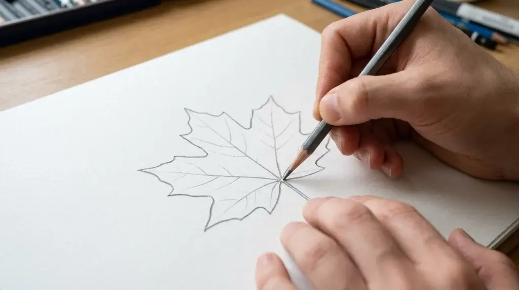
In art, an outline is a line that runs around the outside edge of a shape, figure, or object. Think of tracing your hand on paper. The pencil line around your fingers is an outline. It shows the outer shape and nothing more.
Outlines belong to the art element called line. Many teachers list seven elements of art: line, shape, form, color, value, space, and texture. Outlines connect most closely to line and shape. The line makes the edge, and the edge makes the shape.
An outline can be thick or thin. It can be black, red, blue, or any color. It can be smooth, shaky, or broken into small pieces. Sometimes it is only a guide that the artist draws first and covers later. Other times it is the final look of the work. A cartoon face with a bold black border is a good example of an outline that stays.
One more point matters here. An outline usually shows only the outer edge. It does not show the bumps, folds, or shadows inside the shape. Other tools, like contour lines and shading, do that job.
Why Outlines Matter in Art
Outlines do several important jobs, and each one helps the viewer understand the picture.
First, outlines create clarity. A line around a shape separates it from the background and from other shapes. Your eye can sort out what is what in a heartbeat.
Second, outlines guide the eye. A strong line pulls attention toward a figure or an object. A soft, thin line asks the viewer to look more slowly.
Third, outlines simplify. A real tree has thousands of leaves. An outline lets an artist show “tree” with one clean shape. People can often recognize an object from its outline alone, which is why simple signs and icons work so well.
Fourth, outlines set the style. A picture with heavy black borders feels bold and graphic. A picture with no borders feels soft and dreamy. The choice changes the whole mood before the viewer even thinks about it.
Outline vs. Contour Line vs. Silhouette
These three words get mixed up all the time. They are related, but they are not the same thing. The table below shows the main differences.
| Term | What It Shows | Simple Example |
| Outline | Only the outer edge of a shape | A thick black border around a cartoon cat |
| Contour line | The outer edge plus inner details, like folds and curves | A drawing of a hand that also shows knuckles and wrinkles |
| Silhouette | A solid, filled shape with no inner details | A black paper cutout of a person’s profile |
Here is an easy way to remember it. An outline is a fence around a yard. A contour line is the fence plus the paths and flower beds inside. A silhouette is the whole yard painted in one color.
Some art teachers use “outline” and “contour” as if they mean the same thing. In many classrooms, though, the difference matters. Contour drawing asks you to follow the shape of the form, including the inner edges. Outline drawing asks you to show only the outside border. If your teacher gives you a clear rule, follow that rule.
A Short History of Outlines in Art
Nobody knows exactly when artists first drew an outline. We do know that very old art often uses line to show shape. Cave paintings of animals, such as those found in France, use lines to show the edges of bison, horses, and other creatures. Some of these also use shading, but the lines are easy to see.
Ancient Egyptian wall paintings used clear outlines too. People and animals were drawn with firm edges and filled with flat color. The style was neat and organized, and it was used for hundreds of years.
Ancient Greek vase painters also leaned on line. On painted pottery, sharp lines separated the figures from the background and showed fine details. If you have ever seen a Greek vase with tiny dark figures marching around the pot, you have seen skilled line work.
In medieval manuscripts, monks and artists drew outlines first and then filled them with bright color and gold. Japanese woodblock prints did something similar. In these prints, the outline was carved into a wooden block and printed first. Color was added after that. This is part of why prints from artists like Hokusai look so crisp.
In the late 1800s, some French painters pushed outlines in a new direction. Artists such as Paul Gauguin and Émile Bernard used bold, dark outlines around flat areas of color. A critic later linked the look to cloisonné, a craft where thin metal walls hold bright enamel. That is where the style name Cloisonnism comes from.
At nearly the same time, the Impressionists went the other way. They softened edges and let colors melt together. Later, modern artists, cartoonists, and animators brought bold outlines back in a big way.
What Do Outlines Mean in Art?
Here is a fair warning. There is no single secret code for outlines. Meaning depends on the artist, the culture, and the artwork. Still, some common feelings show up again and again.
A thick, dark outline often feels strong, bold, and direct. It can make a figure look solid and sure of itself. It can also make a picture feel flat, like a sticker or a poster. Many cartoon characters use this look because it is easy to read from far away.
A thin outline usually feels light and gentle. It can suggest delicacy, calm, or quiet. Fine pencil outlines in botanical drawings, for example, help the viewer focus on small details.
A broken or shaky outline can feel unsure, nervous, or full of motion. It might suggest that something is fading, moving, or not fully fixed in place.
A colored outline can add mood. A warm orange line around a yellow flower feels sunny and soft. A deep blue line around a pale blue shape can feel cool and quiet.
No outline at all can also mean something. When edges blend into the background, the picture can feel dreamy, misty, or full of air. The viewer’s eye fills in the missing edge. Artists use this on purpose to create a sense of mystery or motion.
Types of Outlines in Art
Outlines come in many forms. The table below lists the most common types, how they look, and what they are often used for.
| Type of Outline | How It Looks | Common Feeling or Use |
| Thick and bold | Heavy, dark, even border | Strong, graphic, easy to see; used in cartoons and posters |
| Thin and light | Delicate, fine border | Gentle, careful, detailed; used in scientific drawings |
| Broken or dashed | Line with gaps or pieces | Movement, uncertainty, or a sketchy mood |
| Colored | Border in a color other than black | Soft or warm mood; blends with the fill color |
| Varied line weight | Line gets thicker and thinner | Depth, weight, and life; makes drawings feel less flat |
| Lost edge | Edge fades into the background | Dreamy, soft, or mysterious feeling |
Varied line weight deserves a special mention. When an artist makes the line thicker in some places and thinner in others, the drawing gains depth. A thicker line along the bottom of a ball, for example, can suggest weight and shadow. It is a small trick with a big result.
Famous Examples of Outlines in Art
Looking at real artwork is the best way to understand outlines. Here are a few well-known places to see them in action.
Katsushika Hokusai’s The Great Wave off Kanagawa, made around 1831, is a famous Japanese woodblock print. Look closely at the waves, the boats, and Mount Fuji. Clear lines mark their edges, and flat colors fill the spaces between them.
Paul Gauguin’s The Vision After the Sermon, painted in 1888, is a classic example of the bold-outline approach. Dark lines wrap around large patches of flat color. The look is very different from the soft, blurry style of many other paintings from that time.
Keith Haring, an American artist who became famous in the 1980s, built his whole style on thick outlines. His dancing, glowing figures are drawn with simple, bold lines. You can recognize his work from across a room.
Pablo Picasso made many simple line drawings of animals and people. With only a few lines, he could show a dove or a dog so clearly that anyone could name it. That is the power of a good outline: it says a lot with a little.
Ancient Egyptian tomb paintings are another great example. The figures have firm edges and flat color. If you ever visit a museum with Egyptian art, look for how each shape is clearly marked off from the next.
Outline vs. No Outline: How Artists Choose
Many painters think about edges carefully. Some edges should be sharp. Others should be soft or even disappear. Artists often call the sharp ones “found edges” and the vanishing ones “lost edges.”
Why choose one over the other? A sharp edge pulls the eye. A lost edge lets the eye rest. A painter might use a crisp edge on the main subject and let the rest of the picture melt into soft color. This keeps the viewer focused on what matters most.
Outlines suit some goals better than others. If you want a clear, bold, easy-to-read picture, an outline helps a lot. This is why logos, icons, signs, and comics rely on it. If you want a mood, such as fog, sunrise, or a quiet memory, softer edges often work better. Neither choice is right or wrong. The best choice is the one that fits what you want the viewer to feel.
Common Mistakes Beginners Make
Everyone makes mistakes when learning to use outlines. The good news is that most of them are easy to fix once you spot them.
One common mistake is drawing the same line thickness everywhere. Even lines can make a drawing feel stiff and flat. Try making the line a little heavier in places where shapes overlap or where shadows would fall.
Another mistake is pressing too hard with a pencil. Dark, deep lines are hard to erase and can make a drawing look rough. Start light. You can always make a line darker later.
Some beginners outline everything the same way, even when a soft edge would look better. Ask yourself whether each edge needs to be sharp. Sometimes leaving a gap or fading a line makes the drawing feel more natural.
People also mix up outline and contour drawing. If your assignment asks for a contour drawing, remember to include the inner curves and folds. If it asks for an outline, keep it to the outer edge only.
Finally, many beginners trace what they think an object looks like instead of looking at the real thing. Slow down and study the shape. Notice where it curves, where it bends, and where it meets other shapes. Good outlines come from good looking.
How to Use Outlines in Your Own Art
Ready to try it yourself? You do not need fancy tools. A pencil and a sheet of paper are enough.
Start with a simple object, such as a leaf, a mug, or your own hand. Look at it for a few seconds before you draw. Then draw only the outer edge, slowly and with a light touch. Try not to look down at the paper too often. This helps your hand follow what your eye sees.
Next, draw the same object again, but this time add the inner lines. Show the veins of the leaf or the handle of the mug. Now you have made a contour drawing. Put the two drawings side by side. You will see the difference right away.
For a third try, play with line weight. Make the line thicker where the object curves away from the light and thinner where the light hits it. Even this small change can make your drawing feel more real.
If you want to use color, try an outline that is a darker shade of the color inside the shape. A deep green line around a light green leaf looks soft and natural. A black line around the same leaf looks bolder and more cartoonlike. Test both and notice how the mood changes.
If you work on a computer or tablet, draw your outlines on a separate layer. That way you can change the color, the thickness, or even remove the outline later without ruining the rest of your picture.
Outlines in Modern and Digital Art
Outlines are far from old news. You can see them all around you. Cartoons, comic books, and animated shows depend on them. So do coloring books, stickers, icons, and many logos.
Digital tools have made outlines even easier to play with. In drawing apps and design programs, you can change the color or thickness of a line with a tap. Many illustrators work in a bold-outline style because it looks clear on small screens and prints well on products like posters and mugs.
Tattoo art is another place where outlines matter. Artists often start with a strong line to hold the whole design together. In graphic design, outlines help text and shapes stand out, especially on busy backgrounds.
At the same time, many modern artists mix both approaches. They may use a crisp outline on one part of a picture and let another part go soft and blurry. This blend gives the artwork both clarity and mood. If you are curious about current trends, browse illustration sites and museum collections to see how artists are using line today.
FAQs
What is the meaning of outline in art?
An outline is a line that goes around the outer edge of a shape or object. It shows where the shape begins and ends. It usually does not show details inside the shape.
What is the difference between an outline and a contour line?
An outline shows only the outside edge. A contour line also shows inner edges, such as folds, curves, and surface details. Some teachers use the two words in a similar way, so check what your class expects.
Is an outline a line or a shape?
An outline is a line, but it creates a shape. The line is the tool, and the shape is the result. That is why outlines connect to both of these art elements.
Do all artists use outlines?
No. Some artists love bold outlines, and others avoid them. Impressionist painters, for example, often let colors blend so edges look soft. Each artist picks the approach that fits the goal of the artwork.
Why do artists use thick outlines?
Thick outlines make shapes easy to see and give a picture a strong, graphic look. They are common in cartoons, posters, and street art. A thick line can also make a figure feel bold and solid.
Can an outline be any color?
Yes. Black is the most common choice, but an outline can be any color. Artists often pick a darker shade of the fill color for a soft look. A bright or surprising color can create a lively or playful mood.
Conclusion
Outline meaning in art comes down to this: an outline is a line around the outer edge of a shape, and it helps the viewer see, understand, and feel the artwork. It can be thick or thin, dark or colorful, steady or broken. Each choice changes the mood.
Artists have used outlines for a very long time, from cave walls and Egyptian tombs to woodblock prints and modern cartoons. They have also chosen to leave outlines out when a softer, dreamier look worked better.
The best way to learn is to practice. Pick a simple object, draw its outline, then add inner lines, then play with line weight and color. Compare your drawings and notice what changes. With a little patience, you will start to see outlines everywhere, and you will know exactly why artists use them.

Hi, I’m Sarah Mitchell. I love writing faith-based content that brings peace, hope, and encouragement to everyday life. Through prayers and devotionals, my goal is to help readers feel closer to God and stronger in faith.